Mobile commerce has evolved from a novelty to the dominant force in digital transactions, yet a persistent gap remains between mobile traffic volume and conversion rates. While smartphones account for over 60% of global web traffic, mobile conversion rates typically hover around 2-3%, significantly trailing desktop’s 4-5%. This disparity represents billions in lost revenue annually, driven not by lack of intent but by friction-heavy experiences that frustrate users at critical decision points. The challenge facing today’s digital professionals isn’t simply making sites work on mobile—it’s engineering experiences that acknowledge how fundamentally different mobile user behaviour is from desktop interactions. When you design with thumb zones, network variability, and contextual interruptions in mind, conversion rates don’t just improve incrementally; they can double or triple within months.
The technical foundation of high-converting mobile experiences requires more than responsive CSS tweaks. It demands architectural decisions that prioritise performance, anticipate touch-based interaction patterns, and eliminate unnecessary cognitive load. Modern users expect sub-three-second load times, frictionless payment flows, and interfaces that adapt intelligently to their device capabilities. Meeting these expectations requires implementing progressive enhancement strategies, optimising Core Web Vitals metrics, and leveraging cutting-edge technologies like Progressive Web Apps and payment request APIs. The organisations that master these technical disciplines don’t just see better conversion metrics—they fundamentally alter their competitive positioning in increasingly mobile-first markets.
Mobile-first design architecture and progressive enhancement strategies
Progressive enhancement represents a philosophical shift in how digital experiences are constructed, beginning with a functional baseline that works universally before layering sophisticated features for capable devices. This approach contrasts sharply with graceful degradation, where full-featured experiences are built first and then stripped down for less capable devices. By starting with mobile constraints—limited screen real estate, variable network conditions, touch-based interaction—you create a solid foundation that naturally scales upward. The baseline experience should deliver core functionality using semantic HTML and basic CSS, ensuring that even users on outdated devices or slow connections can complete critical tasks. JavaScript enhancements, advanced layout techniques, and rich media elements then progressively activate based on feature detection rather than assumptions about device capabilities.
Implementing responsive grid systems with CSS flexbox and grid layout
Modern CSS layout systems like Flexbox and Grid Layout have revolutionised mobile-first design by providing native solutions for responsive positioning that previously required JavaScript or complex float-based hacks. Flexbox excels at one-dimensional layouts where content flows in a single direction, making it ideal for navigation bars, form controls, and component-level arrangements. Its ability to automatically distribute space and align items makes it particularly valuable for touch interfaces where precise alignment matters for usability. Grid Layout, conversely, handles two-dimensional arrangements where you need simultaneous control over rows and columns, perfect for card-based layouts, product galleries, and dashboard interfaces. When implementing these systems, define breakpoints based on content needs rather than specific device dimensions—your layout should reorganise when the content becomes cramped, not at arbitrary pixel widths that correspond to popular devices.
Touch target optimisation and Thumb-Zone navigation patterns
Human anatomy dictates mobile interaction patterns more than any design trend or aesthetic preference. Research consistently shows that users hold smartphones one-handed 67% of the time, with the thumb serving as the primary interaction mechanism. This creates distinct “zones” of accessibility: the bottom third of the screen is easily reached, the middle third requires stretching, and the top third is difficult to access without shifting grip. Despite this reality, many interfaces place critical actions—primary navigation, search functions, confirmation buttons—in the hardest-to-reach areas. Effective thumb-zone design positions high-frequency actions within the natural arc of thumb movement, typically a curved region in the lower portion of the screen. Touch targets themselves should measure at least 48×48 pixels (approximately 9mm) with adequate spacing between interactive elements to prevent accidental activations. This isn’t merely about comfort; properly sized and positioned touch targets directly impact task completion rates and conversion metrics.
Adaptive image delivery through srcset and picture element implementation
Images represent the largest payload component for most mobile sites, yet many implementations still serve desktop-resolution files to smartphones with screens measuring just a few inches diagonally. The srcset attribute enables browsers to select appropriate image resolutions based on device pixel density and viewport width, automatically serving 2x or 3x resolution images
that match the viewport without wasting bandwidth. For more complex scenarios—such as art-directed hero images or switching between different aspect ratios—the <picture> element allows you to define multiple sources with media queries, serving entirely different assets based on screen width or orientation. Combined with modern formats like WebP or AVIF and server-side compression, adaptive image delivery can cut your image weight by 30–70% on mobile. The result is not just faster load times, but also smoother scrolling and fewer layout shifts, all of which contribute directly to better mobile conversion rates.
Mobile viewport configuration and meta tag optimisation
Even the most carefully designed mobile layout will fail if the browser is not instructed to render it correctly. The <meta name="viewport"> tag controls how a page scales and displays on different devices, and misconfigurations here are a common cause of tiny, zoomed-out interfaces that demand pinch-zoom before any interaction. A typical baseline configuration is <meta name="viewport" content="width=device-width, initial-scale=1, viewport-fit=cover">, which ensures your layout maps 1:1 to the device width and leverages the full screen on edge-to-edge displays. You should avoid disabling user scaling unless you have a very strong accessibility justification, as zoom remains important for users with visual impairments. Additional meta tags, such as theme-color for browser UI tinting and apple-mobile-web-app-capable for standalone iOS experiences, further align the visual shell with your brand and reduce cognitive dissonance during the mobile journey.
Core web vitals optimisation for mobile performance
Google’s Core Web Vitals have become the de facto benchmark for mobile performance, directly influencing both search visibility and user engagement. While these metrics—Largest Contentful Paint (LCP), First Input Delay (FID), Cumulative Layout Shift (CLS), and now Interaction to Next Paint (INP)—may sound academic, they map closely to what users actually feel: speed, responsiveness, and stability. Focusing on these mobile Web Vitals forces teams to prioritise the parts of the experience that matter most at conversion-critical moments, such as first impressions and checkout interactions. Rather than chasing synthetic speed scores alone, we target improvements that reduce real-world frustration and abandoned sessions.
Largest contentful paint reduction through critical CSS and resource prioritisation
LCP measures how long it takes for the largest visible element—often a hero image or prominent heading—to render, making it a powerful proxy for perceived load speed. To improve LCP on mobile, begin by inlining critical CSS for above-the-fold content, ensuring the browser can paint the key layout before fetching secondary stylesheets. Non-essential CSS and JavaScript should be deferred or loaded asynchronously, preventing render-blocking requests on constrained mobile networks. Resource prioritisation techniques like <link rel="preload"> for hero images and key fonts, combined with HTTP/2 multiplexing, help the browser focus its limited bandwidth on what the user sees first. When you pair these optimisations with adaptive image delivery and a lean DOM structure, it’s common to shave several seconds off LCP on mid-range devices.
First input delay mitigation using code splitting and lazy loading
FID captures how quickly a page responds after a user first interacts, such as tapping a button or opening a menu. High FID usually indicates that the main thread is blocked by heavy JavaScript execution, leaving users staring at a frozen interface. Code splitting breaks large bundles into smaller chunks loaded only when needed—checkout logic should not block browsing, and analytics scripts should never delay core interactions. Lazy loading further defers non-critical components, like below-the-fold carousels or secondary widgets, until after the first input opportunity. By trimming third-party scripts, reducing framework overhead, and offloading work to Web Workers where appropriate, you allow the main thread to remain free to respond instantly to touches and taps, which is essential for conversion-focused mobile UX.
Cumulative layout shift prevention with dimension reservations and font loading strategies
CLS measures unexpected layout movements during load, which are particularly jarring on small screens where even minor shifts can cause mis-taps. The simplest way to stabilise layouts is to reserve explicit width and height for images, ads, and embedded media, so the browser can allocate space before content arrives. For fonts, consider using font-display: swap or optional to avoid long invisible text periods, and preload key font files to minimise flash-of-unstyled-text disruptions. Avoid inserting banners, consent prompts, or in-line promotions above existing content after initial render; instead, reserve their space or use overlays that do not push content down. A low CLS not only feels more polished, it prevents costly errors like users accidentally confirming actions or adding unintended items to cart.
Interaction to next paint enhancement via JavaScript optimisation
INP generalises the idea of FID by measuring overall responsiveness across the full session, not just the first interaction. On mobile, this means your site must remain snappy even after users have scrolled, filtered, and opened modals—long after initial load. To keep INP low, break expensive JavaScript tasks into smaller chunks using techniques like requestIdleCallback or setTimeout batching, so the main thread frequently returns to an interactive state. Minimise synchronous layout thrashing by reading and writing DOM measurements in separate phases, and cache calculated values wherever possible. You can also leverage virtualised lists for long product feeds, rendering only visible items instead of hundreds of DOM nodes at once. By treating responsiveness as a continuous requirement rather than a one-time metric, you create mobile experiences that feel fluid from landing page to checkout confirmation.
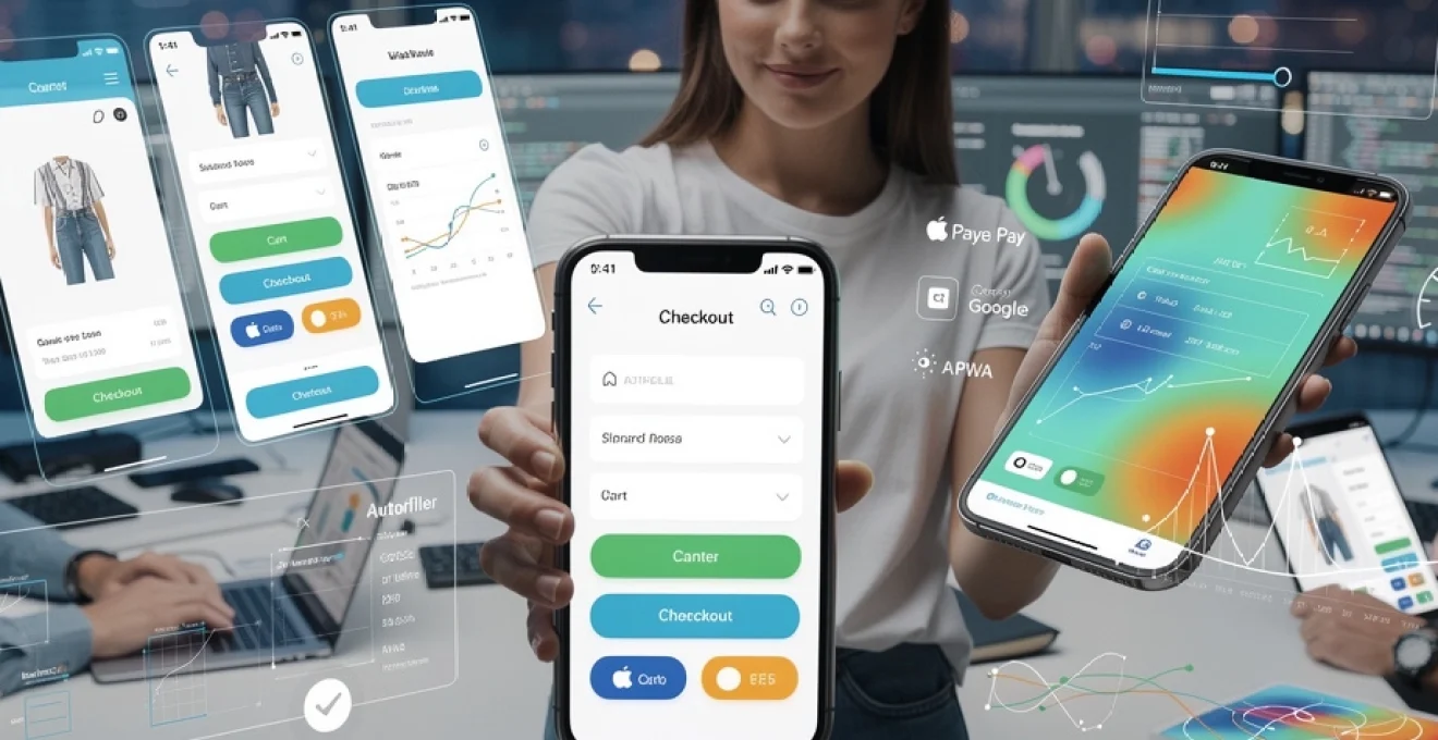
Mobile checkout flow engineering and friction reduction
The checkout flow is where intent turns into revenue—or evaporates due to avoidable friction. Mobile users are often multi-tasking, dealing with smaller screens and intermittent connectivity, which amplifies even minor usability issues. Engineering a high-converting mobile checkout requires a balance between simplicity, trust, and necessary data collection. Every additional field, step, or distraction in the checkout process must be justified by clear business value, because each one represents another chance for abandonment. By rethinking checkout architecture from a mobile-first perspective, we can compress the path to purchase without compromising compliance or security.
Single-page checkout architecture versus multi-step progressive disclosure
One of the key decisions in mobile checkout design is whether to consolidate all steps into a single page or distribute them across a multi-step flow. Single-page checkouts can feel faster because users see all required information at once, but on small screens this can quickly become overwhelming, resembling an endless form. Multi-step progressive disclosure, where information is grouped into logical steps (shipping, billing, review), can reduce cognitive load by letting users focus on one decision at a time. The optimal approach often combines both: a multi-step flow with clear progress indicators and minimal fields per step, implemented as a single-page application to avoid full page reloads. Whichever architecture you choose, the guiding principle is clarity—users should always know where they are, what’s next, and how close they are to completion.
Autofill integration with HTML5 autocomplete attributes and payment request API
Typing on a mobile keyboard is one of the slowest and most error-prone activities in the checkout process, making intelligent autofill a powerful conversion lever. HTML5 autocomplete attributes—such as autocomplete="name", "email", "shipping address-line1", and "cc-number"—allow browsers and password managers to pre-populate fields with stored user data securely. Implementing these attributes consistently across your forms can cut checkout completion time dramatically, especially for repeat customers. For even greater streamlining, the Payment Request API enables the browser to present a native payment sheet populated with saved addresses and cards, reducing the entire checkout to a few taps. While support varies across platforms, progressive enhancement ensures that where the API is available, users benefit from a near-native payment experience without compromising those on older devices.
Digital wallet integration: apple pay, google pay, and shop pay implementation
Digital wallets address one of the biggest psychological and practical barriers to mobile conversion: entering card details on a small screen in a public context. Integrations with Apple Pay, Google Pay, and Shop Pay allow customers to complete purchases using stored payment credentials secured by device-level biometrics. From an implementation standpoint, this involves configuring your payment gateway to support wallet tokens, registering merchant domains with providers, and surfacing wallet buttons only when the user’s device and browser are compatible. Placement matters: wallet options should appear prominently on product or cart pages as “express checkout” options, not buried deep within the payment step. When executed well, digital wallet support can increase mobile checkout completion rates by double digits, especially for returning visitors who value speed and perceived security.
Mobile form field design and input type specification for native keyboards
Form design on mobile is as much about ergonomics as it is about aesthetics. Using the correct input types—such as type="email", "tel", "number", and "password"—prompts native keyboards optimised for the required data, reducing errors and speeding entry. Field grouping and logical sequencing further reduce cognitive load; for example, placing postcode before city when address auto-completion is supported. Visual affordances like large tap targets, clear labels (above fields rather than placeholders only), and inline validation feedback help users recover quickly from mistakes. Think of your form as a guided conversation rather than a bureaucratic document: you’re leading users step by step to a successful outcome, not interrogating them all at once.
Accelerated mobile pages and progressive web application technologies
For content-heavy properties and high-intent transactional flows alike, combining Accelerated Mobile Pages (AMP) and Progressive Web App (PWA) techniques can deliver near-instant experiences that feel indistinguishable from native apps. While AMP once focused primarily on publisher content, its component ecosystem now supports dynamic elements like carousels, forms, and even basic commerce features. PWAs, on the other hand, extend the web with capabilities such as offline support, background sync, and installable experiences. When thoughtfully applied, these technologies reduce friction across the entire user journey—from discovery via search to repeat visits from the home screen.
AMP component library implementation for content-heavy mobile sites
On news, blog, and documentation sites where organic search traffic is critical, AMP can dramatically reduce time-to-first-read on mobile devices. By adhering to a constrained component model and preloading resources from the AMP cache, AMP pages often render in under a second on 3G connections. Components like <amp-img>, <amp-carousel>, and <amp-accordion> allow for rich layouts without custom JavaScript, reducing the risk of performance regressions. For commerce brands with large content marketing programs, AMP versions of key landing pages can serve as ultra-fast entry points that hand off to canonical pages or PWA shells once deeper interaction is required. The key is to maintain tracking and attribution continuity so you can measure how these faster experiences influence eventual mobile conversion rates.
Service worker caching strategies and offline functionality
Service workers are the backbone of Progressive Web Apps, acting as programmable proxies between your web app and the network. By intercepting requests and serving cached responses where appropriate, they enable near-instant repeat visits and robust performance in poor connectivity scenarios. A common starting point is the “app shell” model: cache the core layout, navigation, and branding assets aggressively, while fetching dynamic content like product data or user-specific information from the network. From there, you can refine your caching strategy—using stale-while-revalidate for frequently viewed resources or network-first for time-sensitive APIs. Offline functionality, such as allowing users to browse previously viewed items or compose messages that sync later, not only improves resilience but also signals professionalism and care for the user’s context.
Web app manifest configuration and add-to-homescreen prompts
The Web App Manifest describes how your site should behave when installed on a user’s device, defining properties like name, icons, theme colours, and display mode. When combined with a registered service worker and HTTPS, a proper manifest unlocks “Add to Home Screen” capabilities, letting your mobile experience live alongside native apps. Thoughtful configuration includes providing multiple icon sizes for different densities, setting display="standalone" for a full-screen look, and aligning theme and background colours with your brand palette. Rather than bombarding users with immediate install prompts, it’s more effective to trigger gentle, contextual nudges after they’ve demonstrated engagement—such as on the third visit or after completing a key action. Once installed, PWAs benefit from higher re-engagement rates, which in turn drives more repeat conversions.
Mobile conversion rate optimisation through behavioural analytics
Guesswork is the enemy of effective mobile CRO. While best practices provide a strong starting point, the highest-converting experiences are tuned using real behavioural data from your specific audience. Tools like heatmaps, session recordings, and experimentation platforms illuminate where users struggle, hesitate, or drop off. By pairing quantitative metrics (conversion rate, bounce rate, time to checkout) with qualitative insights (rage taps, scroll depth patterns, hesitation around forms), you can move from generic recommendations to precise interventions that unlock hidden revenue.
Heatmap analysis using hotjar and microsoft clarity for touch interactions
Heatmaps translate thousands of mobile sessions into an intuitive visual language, showing where users tap, scroll, and ignore. On smaller screens, this insight is invaluable: are users trying to interact with non-clickable elements, like images or headings, indicating missing affordances? Are key CTAs buried below the average fold line, visible only after excessive scrolling? Tools such as Hotjar and Microsoft Clarity aggregate touch interactions, revealing “hot” and “cold” zones that often contradict initial design assumptions. By aligning your primary actions with demonstrated attention patterns—and reducing distractions in those areas—you can incrementally nudge more users toward conversion without radical redesigns.
Session recording interpretation and mobile user journey mapping
Session recordings provide the narrative that raw metrics lack, letting you watch real users attempt to accomplish tasks on your mobile site. Patterns such as repeated opening and closing of menus, frantic scrolling back and forth, or frequent back-button usage are strong indicators of confusion or unmet expectations. Mapping these behaviours onto a formal mobile user journey—from landing to exploration to checkout—helps you identify specific steps where friction accumulates. Are users abandoning the process during shipping selection, or when confronted with unexpected fees on the final review page? When you link these observations back to design decisions and technical constraints, you can prioritise targeted fixes that reduce drop-offs where they hurt most.
A/B testing frameworks: google optimize and VWO mobile experimentation
Once you’ve identified potential improvements, controlled experimentation validates which changes actually enhance mobile conversion rates. Platforms like VWO and, historically, Google Optimize (or its successors) allow you to run A/B and multivariate tests on headlines, layouts, button copy, and even full checkout flows. On mobile, it’s especially important to account for sample size and test duration, as traffic patterns and behaviour can differ dramatically between weekdays and weekends. Designing experiments around clear hypotheses—such as “moving the primary CTA into the thumb zone will increase tap-through by 10%”—helps focus analysis and avoids chasing noise. Over time, a disciplined testing program turns mobile optimisation into a repeatable process, where each win builds on documented learnings rather than one-off intuition.
Mobile payment gateway integration and security protocols
Trust is the invisible currency of mobile commerce. No matter how seamless your UX or how fast your pages load, users will hesitate—or abandon entirely—if they doubt the safety of their payment details. Robust payment gateway integration and adherence to modern security protocols are therefore not just compliance checkboxes, but critical drivers of conversion. By surfacing security assurances at the right moments and architecting your stack to minimise risk, you create an environment where completing a purchase feels as safe as it is simple.
PCI DSS compliance and tokenisation implementation with stripe and braintree
The Payment Card Industry Data Security Standard (PCI DSS) defines how cardholder data must be handled, stored, and transmitted. For most organisations, the most pragmatic path to compliance is to avoid touching raw card data altogether by using hosted fields or client-side tokenisation from providers like Stripe and Braintree. In this model, sensitive details are entered into iframes or native elements controlled by the gateway, which then returns a token representing the payment method. Your servers never see the card number, dramatically reducing your compliance scope and breach risk. From a user’s perspective, the experience remains embedded and branded, but under the surface, you’re delegating the most sensitive responsibilities to battle-tested specialists.
3D secure authentication and strong customer authentication requirements
Regulations such as PSD2 in Europe mandate Strong Customer Authentication (SCA) for many online transactions, typically enforced through 3D Secure (3DS) flows. Poorly implemented 3DS on mobile can feel jarring, bouncing users to unfamiliar bank pages with clunky interfaces that tank conversion. Modern gateways offer frictionless 3DS experiences that use risk-based assessment to skip challenges where possible and present streamlined, responsive challenge screens when required. As you integrate 3DS, focus on preserving context: keep the checkout UI visible behind the challenge frame, explain briefly why extra verification is needed, and reassure users that this step protects them. When handled well, SCA becomes a trust signal rather than an obstacle, particularly for high-value purchases or new customers.
Mobile biometric payment authentication via touch ID and face ID APIs
Biometric authentication—via Touch ID, Face ID, or Android equivalents—bridges the gap between security and convenience, allowing users to approve payments with a fingerprint or glance. On the web, these capabilities surface through platform features like WebAuthn and native wallet integrations that delegate authentication to the device’s secure enclave. When you combine tokenised payment methods with biometric confirmation, the result is a checkout that feels as effortless as unlocking the phone itself. This not only shortens the path to purchase, it also reassures users that even if their phone is lost, unauthorised transactions remain unlikely. In a world where mobile devices are both shopping carts and keys, leaning into secure biometrics is one of the most effective ways to boost confidence and conversions simultaneously.