Professional branding agencies transform businesses through systematic approaches that blend strategic thinking with creative execution. The modern marketplace demands more than attractive logos and colour schemes—it requires comprehensive visual identity systems that communicate brand values, differentiate companies from competitors, and create lasting emotional connections with audiences. Understanding how agencies navigate these complex projects reveals the sophisticated methodologies behind successful brand transformations.
The journey from initial client brief to final brand implementation involves multiple phases, each requiring specific expertise and careful coordination. Successful agencies combine research-driven strategies with creative excellence, ensuring that every visual element serves both aesthetic and business objectives. This comprehensive approach explains why professional branding projects typically range from £20,000 to £50,000 or more, depending on scope and complexity.
Strategic brand discovery and research methodologies
The foundation of any successful branding project lies in thorough discovery and research. Agencies begin by conducting extensive stakeholder interviews, market analysis, and competitive audits to understand the brand’s current position and future aspirations. This strategic foundation ensures that creative decisions align with business objectives and resonate with target audiences.
Stakeholder mapping and client brief analysis techniques
Effective stakeholder mapping involves identifying all individuals who influence or are influenced by the brand. Agencies typically conduct interviews with C-suite executives, marketing teams, sales representatives, and customer service staff to gather diverse perspectives. This multi-faceted approach reveals internal brand perceptions and potential conflicts that could impact the project’s success.
Client brief analysis extends beyond surface-level requirements to uncover underlying business challenges and opportunities. Professional agencies probe deeper into stated objectives, questioning assumptions and exploring unstated needs. This process often reveals gaps between what clients think they need and what research indicates would be most effective for their specific market position.
Competitive brand audit using SWOT and positioning matrix frameworks
Comprehensive competitive analysis employs structured frameworks like SWOT analysis and positioning matrices to map the competitive landscape. Agencies examine direct and indirect competitors, analysing their visual identities, messaging strategies, and market positioning. This systematic approach identifies white spaces in the market where the client’s brand can establish a unique and defensible position.
The positioning matrix framework helps agencies visualise how competitors cluster around specific attributes or benefits. By plotting competitors on axes representing key differentiators—such as premium versus accessible, or traditional versus innovative—agencies can identify optimal positioning opportunities that leverage the client’s strengths while avoiding oversaturated market segments.
Target audience persona development through demographic and psychographic research
Modern persona development goes beyond basic demographics to explore psychographic factors that drive purchasing decisions. Agencies conduct qualitative research through focus groups, interviews, and observational studies to understand audience motivations, fears, aspirations, and decision-making processes. This deep understanding informs every aspect of the visual identity, from colour psychology to typography choices.
Psychographic profiling reveals how audiences relate to brands on emotional levels, enabling agencies to craft visual identities that trigger desired emotional responses. For instance, understanding that a target audience values authenticity over perfection might lead to design choices that embrace hand-drawn elements rather than overly polished digital graphics.
Brand equity assessment using keller’s Customer-Based brand equity model
Kevin Keller’s Customer-Based Brand Equity model provides agencies with a structured framework for evaluating existing brand strength and identifying improvement opportunities. This four-level pyramid—brand identity, brand meaning, brand responses, and brand relationships—helps agencies understand how audiences currently perceive the brand and where interventions might be most effective.
Agencies use surveys, interviews, and brand tracking studies to measure performance at each pyramid level. The assessment reveals whether awareness issues, perception problems, or relationship challenges represent the primary obstacles to brand growth. These insights directly influence design strategy, ensuring that visual identity changes address the most critical brand equity gaps.
Visual identity system architecture and design principles
Creating cohesive visual identity systems requires systematic approaches that ensure consistency across all brand touchpoints. Professional agencies develop comprehensive design frameworks that guide decision-making throughout the creative process, establishing rules and principles that maintain visual coherence while allowing for creative flexibility.
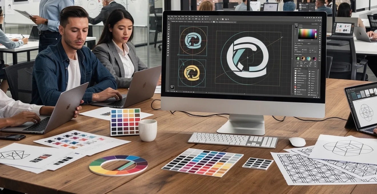
Logo design iterations using golden ratio and Grid-Based
construction methods
For logo design, agencies frequently rely on geometric constructions such as the golden ratio and grid-based systems to achieve balance, harmony, and visual stability. While not every successful logo is mathematically perfect, these frameworks help designers refine proportions, spacing, and alignment so marks feel intuitively “right” at a glance. Grids also support consistency across logo variations, icon sets, and lockups with taglines or descriptors.
The iterative process typically starts with rapid sketching and low-fidelity concepts before moving into vector-based refinement. Agencies will test each logo iteration in real-world contexts—on packaging, social media avatars, app icons, and signage—to evaluate legibility and impact. This approach prevents the common mistake of choosing a logo solely from a presentation slide, instead validating how it performs across the entire visual identity system.
Typography hierarchy development with modular scale systems
Typography is one of the most powerful tools in a branding and visual identity project, shaping both readability and personality. Agencies develop type hierarchies using modular scale systems, which establish consistent relationships between font sizes (for example, using ratios like 1.125, 1.2, or 1.333). This creates a predictable rhythm across headings, subheadings, body text, captions, and microcopy, making layouts feel cohesive and intentional.
Rather than choosing typefaces purely on aesthetic preference, teams consider brand attributes, accessibility requirements, and technical performance. A financial services brand may require a more traditional serif for trust and stability, paired with a clean sans serif for digital interfaces. Agencies also plan for multilingual support, variable font performance, and license management, ensuring the typography system scales as the brand grows across markets and platforms.
Colour psychology application and pantone colour system implementation
Colour decisions in branding agencies are grounded in both psychology and practicality. Research into colour associations guides which hues best reflect brand attributes—such as blue for reliability, green for sustainability, or orange for energy and creativity. However, agencies also look at competitive colour usage to avoid blending into the category “sea of sameness.” A challenger brand, for instance, might deliberately adopt a contrasting palette to stand out on crowded shelves or in digital feeds.
To maintain consistency across print and digital media, agencies specify colours using multiple colour models: Pantone for spot inks, CMYK for print processes, RGB for screens, and HEX for web environments. They create clear conversion tables and tolerances, acknowledging that colour rendering will vary across devices and substrates. This disciplined approach to colour management helps prevent the brand from appearing inconsistent or “off” as it rolls out globally.
Brand pattern language creation using sacred geometry and mathematical ratios
Beyond logos and colour, agencies often design pattern languages that extend the visual identity into packaging, digital backgrounds, and environmental graphics. Sacred geometry and mathematical ratios—such as Fibonacci spirals, hexagonal grids, or isometric constructions—provide underlying structures that feel ordered and visually satisfying. These patterns act like a visual “accent language,” supporting the core identity without overwhelming it.
Pattern systems are designed with scalability and versatility in mind. Agencies create primary, secondary, and tertiary patterns that can be used at different scales and opacities, from subtle textures behind typography to bold hero graphics on campaign visuals. By defining how patterns interact with photography, typography, and colour, they ensure the overall brand identity remains cohesive rather than chaotic when used by different teams and partners.
Brand guidelines documentation and asset management
Once the visual identity system is defined, agencies translate it into structured documentation and asset ecosystems. This phase is critical for protecting brand consistency as implementation shifts from designers to marketers, developers, printers, and external partners. Without robust guidelines and asset management, even the most sophisticated branding work can quickly fragment across channels and geographies.
Comprehensive style guide creation using adobe InDesign templates
Brand guidelines—often produced in Adobe InDesign—serve as the central reference for how the brand should look, feel, and sound. Modern style guides typically include sections on brand strategy, visual identity elements, tone of voice, and application examples across key touchpoints. Instead of static rulebooks, leading agencies now create “living” documents that balance principles with practical examples, making it easier for non-designers to apply the brand correctly.
Using modular InDesign templates, teams can quickly update sections as the brand evolves, export interactive PDFs, or adapt content for online brand portals. Clear do’s and don’ts, layout grids, and usage scenarios (such as social posts, presentations, email signatures, and product packaging) help internal teams understand not just what to do, but why. This reduces ambiguity and support requests, speeding up day-to-day content creation while preserving brand integrity.
Digital asset library organisation through DAM platforms like brandfolder
To support consistent implementation, agencies often help clients set up digital asset management (DAM) systems such as Brandfolder, Bynder, or Frontify. These platforms centralise logos, templates, imagery, icon libraries, and brand documentation in a single, permission-based environment. Instead of hunting through email threads or outdated shared drives, teams can quickly access approved, up-to-date assets.
Agencies structure these libraries using clear taxonomies, metadata, and version control rules. Assets may be grouped by campaign, region, channel, or product line, making it easier for users to find what they need without guesswork. Some DAM systems also integrate directly with design and marketing tools, allowing designers and content creators to pull brand assets into their workflows without manual downloads, reducing errors and saving time.
Print production specifications and CMYK colour profile standards
For brands that rely on physical touchpoints—packaging, brochures, signage, or retail environments—print production standards are a vital part of the brand guidelines. Agencies define CMYK colour builds, recommended paper stocks, finishing options, and minimum size specifications for critical elements like logos and typography. They may also provide die-line templates, embossing guidelines, and spot varnish instructions for high-end applications.
To mitigate colour inconsistencies across printers and regions, agencies specify ICC profiles, proofing processes, and quality checks such as contract proofs or wet proofs. Clear guidance on bleed, trim, and safe areas helps prevent costly production errors. This level of detail turns branding from a purely creative exercise into a reliable, repeatable production system that scales globally.
Responsive logo scalability testing across multiple device breakpoints
As audiences interact with brands across smartphones, tablets, laptops, and large-format screens, responsive logo systems have become standard practice. Agencies design logo variations for different sizes and contexts—such as full lockups, simplified marks, and icons—then test them across key breakpoints. The goal is to preserve recognisability and legibility whether the logo appears on a smartwatch notification or a conference banner.
Testing goes beyond simple resizing. Teams evaluate how logos perform on dark and light backgrounds, within app favicons, in social media profile images, and within video overlays. This process often reveals the need for alternate versions, such as single-colour or flat variants. By documenting when and where each logo version should be used, agencies help brands avoid stretched, pixelated, or illegible marks in critical digital contexts.
Cross-platform brand implementation strategies
With strategy, identity, and guidelines in place, agencies shift focus to cross-platform implementation. This phase ensures that branding and visual identity are expressed consistently across websites, apps, social media, packaging, advertising, and physical environments. The challenge is to balance consistency with channel-specific optimisation—what works on a billboard may not translate directly to a mobile interface.
Agencies typically start by prioritising key touchpoints based on customer journeys and business objectives. For a direct-to-consumer brand, this might mean focusing first on e-commerce, email, and social; for a B2B organisation, it could be sales decks, proposals, and LinkedIn. In each case, the visual identity system is adapted to the medium while preserving core elements such as logo usage, colour hierarchy, and typography.
Integrated campaigns often serve as real-world testing grounds for new brands. Agencies develop multi-channel launches that include website updates, organic and paid social content, out-of-home advertising, and internal communications. Analytics and feedback from these campaigns inform refinements to templates, messaging, and creative guidelines. In essence, implementation becomes a feedback loop: you launch, measure, learn, and iterate, keeping the brand both consistent and responsive to market realities.
Client collaboration frameworks and project management systems
Branding and visual identity projects succeed when agencies and clients operate as true partners. To facilitate this, agencies rely on structured collaboration frameworks supported by modern project management tools. These frameworks clarify decision-making processes, feedback cycles, and approval stages, reducing the risk of scope creep, misalignment, or last-minute surprises.
Many agencies use platforms like Asana, Monday.com, or Jira to manage tasks, milestones, and dependencies. These tools provide transparency across teams, ensuring stakeholders can see what stage the project is in at any moment. Design-specific tools like Figma, Adobe XD, or InVision enable real-time collaboration on visual assets, allowing clients to comment directly on layouts and prototypes rather than relying on ambiguous email feedback.
Clear communication rituals—such as weekly stand-ups, milestone presentations, and executive check-ins—keep everyone aligned. Agencies often define “feedback frameworks” that guide clients on how to respond constructively, focusing on objectives and user outcomes rather than subjective preferences. This not only speeds up revisions but also helps educate internal teams on how to think strategically about branding decisions.
Because branding projects can span months and involve multiple departments, change management is also part of the collaboration framework. Agencies may support internal brand rollouts with training sessions, launch playbooks, and Q&A workshops. By equipping teams with the knowledge and tools they need, they reduce resistance and increase adoption of the new identity across the organisation.
Quality assurance and brand compliance monitoring protocols
Even the most carefully crafted brand system can erode over time without ongoing quality assurance and compliance monitoring. Agencies therefore help clients establish protocols to protect visual identity consistency long after the initial project concludes. This often includes both manual review processes and automated tools that flag deviations from brand standards.
Some organisations implement central brand governance teams responsible for reviewing key materials—major campaigns, new product launches, or high-visibility partnerships—before they go live. Agencies may provide checklists and review frameworks that assess alignment with core elements such as logo usage, colour ratios, typography hierarchy, and tone of voice. Periodic brand audits, conducted annually or biannually, evaluate how well the identity is being applied across channels and regions.
Technology also plays a growing role in brand compliance. Template-based systems in tools like Canva for Teams, Microsoft 365, or Google Workspace allow marketers and sales teams to create on-brand assets without advanced design skills. Some DAM platforms include brand compliance modules that restrict access to deprecated assets and surface recommended, up-to-date files instead. The aim is to make the “right” choice the easiest one for everyday users.
Ultimately, quality assurance is less about policing and more about stewardship. When agencies and internal teams treat branding as a long-term asset to be maintained—rather than a one-off project—the visual identity remains strong, coherent, and effective as the business evolves. This disciplined approach ensures that every new campaign, product, or touchpoint reinforces the brand rather than diluting it, protecting the investment made in the original branding and visual identity project.