In the digital landscape, you have approximately 50 milliseconds to capture a user’s attention and form a lasting first impression. This brief window represents the difference between engagement and abandonment, conversion and bounce rate statistics that haunt digital marketers worldwide. Modern neuroscience reveals that our brains process visual information at extraordinary speeds, making snap judgments about credibility, usability, and trustworthiness before conscious thought even begins.
The psychology behind these rapid assessments stems from evolutionary survival mechanisms, where quick decision-making meant the difference between life and death. Today’s digital interfaces trigger these same neural pathways, creating immediate emotional responses that influence purchasing decisions, brand perception, and user behaviour. Understanding how cognitive processes shape these crucial first moments enables designers and developers to create experiences that resonate on both conscious and subconscious levels.
Cognitive load theory and visual processing in digital interface design
Cognitive load theory fundamentally explains how the human brain processes information in digital environments. When users encounter a new interface, their working memory can only handle approximately seven pieces of information simultaneously. This limitation, first identified by psychologist George Miller, directly impacts how interface elements should be arranged and prioritised to prevent cognitive overload.
Visual hierarchy becomes critical in managing this cognitive burden. The brain processes information through distinct channels – visual, auditory, and kinesthetic – with visual processing dominating digital experiences. Strategic visual design can significantly reduce cognitive load by guiding attention through deliberate colour contrast, typography choices, and spatial relationships between elements.
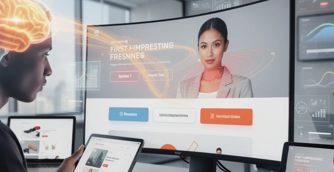
System 1 vs system 2 processing in user interface comprehension
Daniel Kahneman’s groundbreaking research identifies two distinct modes of thinking that directly impact user interface comprehension. System 1 operates automatically and rapidly, requiring minimal mental effort, while System 2 demands deliberate concentration and conscious decision-making. Understanding this distinction proves essential for creating interfaces that leverage automatic processing whilst minimising mental strain.
System 1 processing enables users to instantly recognise familiar patterns, such as shopping cart icons or hamburger menu symbols. These cognitive shortcuts allow for immediate comprehension without engaging higher-level thinking processes. Effective interface design capitalises on these automatic responses by incorporating universally recognised design patterns and maintaining consistency across touchpoints.
Conversely, System 2 processing becomes activated when users encounter unfamiliar layouts or confusing navigation structures. This cognitive burden increases abandonment rates and negatively impacts user satisfaction. Research indicates that interfaces requiring extensive System 2 engagement see conversion rates decrease by up to 40% compared to intuitively designed alternatives.
Gestalt principles applied to landing page visual hierarchy
Gestalt psychology provides fundamental insights into how humans perceive visual arrangements, offering practical applications for landing page design. The principle of proximity suggests that elements positioned closely together appear related, enabling designers to create logical groupings of information without explicit borders or containers.
The law of similarity indicates that elements sharing visual characteristics – colour, shape, or size – form perceived relationships in users’ minds. This principle proves particularly valuable for creating consistent call-to-action styling throughout a website, ensuring users can immediately identify interactive elements regardless of page location.
Closure and continuation principles help users understand incomplete information and follow visual paths across interfaces. Strategic application of these principles enables designers to guide users through desired user flows whilst maintaining clean, uncluttered aesthetics that support rather than hinder comprehension.
Miller’s rule and information architecture in digital navigation
Miller’s Rule, establishing the magical number seven plus or minus two for working memory capacity, directly influences navigation structure and information architecture decisions. Primary navigation menus exceeding this limit create decision paralysis and increase cognitive load, resulting in decreased user engagement and higher bounce rates.
Successful information architecture employs categorisation strategies that respect cognitive limitations whilst providing comprehensive access to content. Card sorting methodologies help identify natural groupings that align with user mental models, ensuring navigation structures feel intuitive rather than imposed by organisational hierarchies.
Progressive disclosure techniques further support cognitive load management by presenting information in digestible chunks. This approach prevents overwhelm whilst maintaining access to detailed information for users requiring deeper engagement with content or products.
Fitts’s law implementation for Touch-Based interface elements
In practical terms, Fitts’s Law tells us that larger, closer targets are faster and easier to tap, especially on small mobile screens. Critical interface elements such as primary navigation, add-to-cart buttons, and form submissions should therefore be generously sized and positioned within natural thumb zones. Research on mobile ergonomics shows that tap targets of at least 44×44 pixels significantly reduce interaction errors and frustration.
Designers should also consider edge and corner advantages, where targets placed near screen edges can be acquired more quickly because users do not need to precisely control overshooting. However, this benefit must be balanced against accidental taps, particularly for destructive actions such as deleting items or cancelling orders. By aligning button size, spacing, and placement with Fitts’s Law, you create touch-based interfaces that feel effortless from the very first interaction.
Conversion rate optimisation through above-the-fold visual design
Above-the-fold content plays an outsized role in first impressions, directly influencing conversion rate optimisation and key user experience metrics. When users arrive on a page, they quickly scan the initial viewport to decide whether to stay, scroll, or bounce. This moment is where visual hierarchy, copy clarity, and interaction cues must work together to communicate value, reduce uncertainty, and showcase the next best action.
Effective above-the-fold visual design treats the initial screen as a concise value proposition rather than a compressed version of the entire page. Instead of overloading this space with competing messages, successful digital experiences prioritise a single primary goal—such as starting a trial, exploring a product category, or learning more about a service. By aligning this focus with user intent, you convert fleeting attention into meaningful engagement.
F-pattern and Z-Pattern eye-tracking heatmap analysis
Eye-tracking research consistently reveals two dominant scanning behaviours on web pages: the F-pattern and the Z-pattern. On content-heavy pages such as blogs or category listings, users tend to follow an F-shaped pattern, scanning the top line fully, then moving down and scanning shorter horizontal lines, with a quick vertical glance along the left side. This behaviour suggests that critical information, such as headings and key benefits, should appear along these scan paths to support fast comprehension.
On simpler landing pages or minimalist interfaces, users often adopt a Z-pattern, scanning from top left to top right, then diagonally down to the bottom left, and again across to the bottom right. This pattern lends itself well to structuring hero sections where logo and navigation sit at the top, the main headline and subheading occupy the centre, and a primary call-to-action appears in the bottom-right focal point. By designing above-the-fold layouts that respect these natural scanning patterns, you reduce cognitive friction and gently guide users towards desired interactions.
Progressive disclosure techniques in e-commerce product pages
Progressive disclosure is an essential strategy for managing information density on e-commerce product pages, where first impressions must balance clarity with depth. Instead of overwhelming users with every possible detail at once, progressive disclosure reveals information in layers—starting with core attributes such as price, size, and primary benefits, then allowing users to access more specific details on demand. This approach mirrors an in-store experience where you notice the product first, then check the label only if interested.
Accordions, expandable sections, and clearly labelled tabs can all support progressive disclosure for specifications, reviews, and shipping details. When implemented thoughtfully, these patterns keep the above-the-fold area visually clean while still signalling that additional information is readily available. The result is a product page that feels approachable at first glance yet satisfies more analytical shoppers who want to scrutinise materials, sizing guides, or warranty terms before committing to purchase.
Hero section typography psychology and brand perception
Typography in the hero section plays a pivotal role in shaping brand perception and emotional response during those crucial first seconds. Large, bold headlines convey confidence and clarity, while more refined, serif typefaces can suggest tradition, craftsmanship, or luxury. Studies in typographic psychology indicate that users often infer personality traits—such as reliability, innovation, or friendliness—from font choices before they process the actual copy.
To create a strong digital first impression, hero typography must balance aesthetics with legibility. Line length, line height, and contrast ratios should work together to ensure that your primary message can be read and understood in a single glance, even on smaller mobile screens. Consider the hero as your digital elevator pitch: if users cannot instantly grasp what you offer and why it matters, they are unlikely to invest additional cognitive effort exploring the rest of the interface.
Call-to-action button colour psychology and contrast ratios
Call-to-action (CTA) buttons translate first impressions into measurable actions, making their colour, size, and contrast critical to conversion rate optimisation. Colour psychology suggests that hues can evoke specific emotional responses—such as urgency with red, trust with blue, or growth with green—but context, brand palette, and cultural associations all influence how these choices are interpreted. Rather than chasing universal “best” colours, effective CTA design focuses on distinctiveness within the page’s visual environment.
High contrast ratios between the CTA and its background improve visibility and accessibility, especially for users with visual impairments or on low-quality screens. Standards such as WCAG recommend a minimum contrast ratio of 4.5:1 for text and 3:1 for large UI elements, ensuring that your primary action stands out without overwhelming the design. When CTAs are visually prominent yet harmonious, users instinctively recognise where to click next, reducing hesitation and increasing the likelihood of immediate engagement.
Core web vitals impact on user experience metrics
Core Web Vitals, introduced by Google, quantify how real users experience page loading, interactivity, and visual stability. These metrics—Largest Contentful Paint (LCP), First Input Delay (FID), and Cumulative Layout Shift (CLS)—directly influence both search visibility and user satisfaction. From a first-impression standpoint, they answer three key questions: how fast does the main content appear, how quickly can users interact, and how stable does the page feel while loading?
Sites that perform well on Core Web Vitals consistently show lower bounce rates, higher engagement, and stronger conversion rates. Users rarely articulate these technical aspects explicitly; instead, they simply perceive the experience as “smooth” or “frustrating.” By treating Core Web Vitals as user experience KPIs rather than purely SEO requirements, you create digital interfaces that feel responsive, trustworthy, and worth spending time with.
Largest contentful paint optimisation for image-heavy websites
Largest Contentful Paint measures how long it takes for the largest visible content element—often a hero image or video—to appear on the screen. For image-heavy websites such as e-commerce, travel, or portfolio platforms, LCP is frequently the deciding factor in whether users wait or abandon. Industry benchmarks recommend an LCP of 2.5 seconds or less for a good user experience, particularly on mobile networks where bandwidth can be inconsistent.
To optimise LCP, designers and developers should prioritise responsive image formats (such as WebP or AVIF), appropriate sizing, and server-side compression. Techniques like lazy loading should be applied carefully, ensuring that above-the-fold media loads immediately while deferring off-screen assets. When the main visual content appears quickly and crisply, users feel reassured that the site is reliable, encouraging them to continue exploring rather than seeking faster alternatives.
First input delay reduction through JavaScript bundle splitting
First Input Delay captures the time between a user’s first interaction—such as tapping a button or link—and the browser’s response. Long FID often stems from heavy JavaScript execution that blocks the main thread, leaving interfaces feeling unresponsive even after visible content has loaded. From a psychological perspective, this disconnect between what users see and what they can do undermines trust and creates a jarring first impression.
JavaScript bundle splitting and code-splitting strategies help mitigate this issue by loading only the scripts required for the initial view while deferring less critical functionality. Tree-shaking, asynchronous loading, and prioritising interaction-critical scripts ensure that user inputs are handled promptly. When users experience instant feedback from their first tap or click, they subconsciously categorise the site as modern, efficient, and well-engineered.
Cumulative layout shift prevention in dynamic content loading
Cumulative Layout Shift measures unexpected movement of elements on the page during load, a common source of user frustration. Sudden shifts—such as buttons jumping as ads load or text blocks pushing content down—can lead to accidental taps, lost reading position, and a perception of poor craftsmanship. In high-stakes contexts like checkout flows, these micro-frictions can directly translate into lost revenue.
Preventing CLS involves reserving space for dynamic elements, defining explicit width and height attributes for images, and avoiding late-loading content above existing elements. Skeleton screens and placeholder boxes can provide visual stability while content is fetched, giving users a sense of continuity instead of chaos. A visually stable interface supports a calm first impression, allowing users to focus on decisions rather than compensating for layout unpredictability.
Time to interactive benchmarks for mobile-first design
Time to Interactive (TTI) reflects how long it takes for a page to become fully usable, not just visually present. For mobile-first design, achieving a TTI under 5 seconds on average mobile hardware is a common target, with high-performing sites often striving for 3 seconds or less. When TTI is slow, users may perceive the interface as “frozen,” leading them to repeatedly tap controls, reload the page, or abandon the session entirely.
Optimising TTI requires a holistic approach: minimising render-blocking resources, compressing assets, leveraging browser caching, and deferring non-essential scripts. Thinking of TTI as the moment when your digital “shop door” truly opens helps prioritise improvements. After all, what value is a beautifully designed storefront if customers perceive the door as stuck when they first try to enter?
Neuromarketing applications in digital user interface psychology
Neuromarketing applies insights from neuroscience to understand how users emotionally and subconsciously respond to digital experiences. Tools such as EEG, fMRI, and biometric tracking reveal that many interface decisions—like whether to trust a brand, click a button, or continue scrolling—are driven by automatic, pre-rational processes. In the context of first impressions, neuromarketing helps explain why subtle changes in colour, imagery, or microcopy can dramatically influence behaviour.
For example, warm, human-centred imagery often activates brain regions associated with empathy and social connection, making users more receptive to brand messages. Similarly, scarcity cues (“Only 3 left in stock”) and social proof (“Over 10,000 customers trust us”) can trigger loss-aversion and herd behaviour biases, encouraging faster decision-making. When used ethically, these techniques enhance clarity and confidence, guiding users toward choices that align with their goals rather than manipulating them against their interests.
A/B testing methodologies for first impression optimisation
A/B testing provides a rigorous framework for validating how design changes impact first impressions and key performance metrics. Instead of relying on opinion or intuition, you present different versions of a page or element—such as hero headlines, imagery, or CTA placement—to statistically comparable user groups and measure the outcome. Over time, this evidence-based approach refines your digital experience to better match user expectations and reduce friction in the initial moments of interaction.
To optimise first impressions, tests should focus on above-the-fold elements that users encounter immediately: value propositions, visual hierarchy, loading states, and early interaction cues. Clear hypotheses—such as “Simplifying the hero copy will reduce bounce rate” or “Increasing CTA contrast will improve click-through rate”—help prioritise experiments and interpret results. By continuously iterating through A/B tests, you transform first impressions from a guessing game into a measurable, improvable aspect of your digital strategy.
Cross-platform consistency in multi-touch point digital ecosystems
In a multi-touch point digital ecosystem, users interact with brands across websites, mobile apps, social media, email, and even in-store digital displays. First impressions are no longer tied to a single visit; they accumulate across platforms to form a cohesive—or fragmented—perception of your brand. Consistency in visual language, tone of voice, interaction patterns, and performance standards helps users feel oriented, regardless of where they first encounter you.
Cross-platform consistency does not mean identical interfaces on every device, but rather a unified experience adapted to each context. Navigation patterns should feel familiar, core colours and typography should remain recognisable, and key messages should reinforce the same value proposition. When a user moves from a social ad to a mobile landing page and then to a desktop dashboard, they should sense continuity, not contradiction. This coherent experience strengthens trust, reduces relearning, and ensures that each new first impression builds on the last instead of starting from zero.