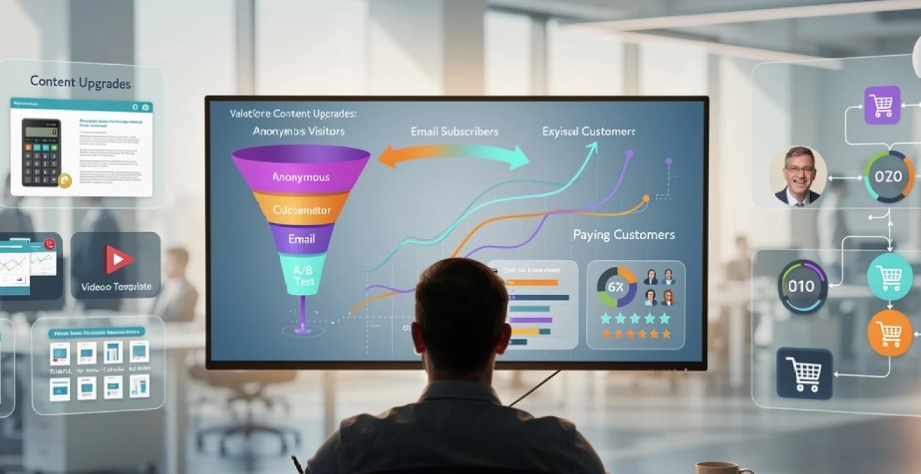
Content upgrades have emerged as one of the most powerful tools in the digital marketer’s arsenal, transforming how businesses capture leads and nurture prospects through their sales funnels. These strategically positioned bonus materials offer immediate value to readers whilst simultaneously building subscriber lists and establishing brand authority. Research consistently demonstrates that well-crafted content upgrades can increase conversion rates from a baseline 2% to an impressive 30% or higher, fundamentally changing the economics of digital marketing campaigns.
The effectiveness of content upgrades lies in their ability to bridge the gap between casual content consumption and meaningful engagement. Unlike traditional lead magnets that often feel disconnected from the reader’s immediate interests, content upgrades are specifically tailored to complement the blog post or article being consumed. This contextual relevance creates a natural progression from reading to subscribing, making the conversion feel both logical and beneficial to the prospect.
Modern consumers have become increasingly selective about sharing their contact information, making traditional broad-appeal lead magnets less effective than ever before. Content upgrades address this challenge by offering hyper-specific value that directly relates to the content the reader is already engaging with. This approach not only improves conversion rates but also ensures higher quality leads who are genuinely interested in your offerings.
Lead magnet psychology: converting anonymous visitors through Value-Driven content upgrades
Understanding the psychological principles that drive conversion behaviour is essential for creating content upgrades that resonate with your target audience. The human brain is wired to seek patterns, assess value, and make decisions based on emotional triggers combined with logical reasoning. Successful content upgrades tap into these fundamental psychological drivers to create compelling offers that feel irresistible to qualified prospects.
Reciprocity principle application in digital marketing funnels
The reciprocity principle, first articulated by psychologist Robert Cialdini, suggests that people feel obligated to return favours when someone provides them with value. In the context of content upgrades, this principle manifests when you offer genuinely useful resources without immediately requesting anything in return except an email address. The perceived value exchange feels balanced, reducing the psychological resistance typically associated with lead capture forms.
Effective implementation of reciprocity requires careful consideration of the value proposition being offered. Your content upgrade must solve a specific problem or provide insights that would typically require significant time investment to discover independently. When prospects recognise this value, they naturally feel more inclined to reciprocate by providing their contact information and engaging further with your brand.
Cognitive bias exploitation through exclusive resource positioning
Cognitive biases significantly influence decision-making processes, and savvy marketers leverage these psychological shortcuts to increase conversion rates. The exclusivity bias, for instance, makes people value resources more highly when they perceive them as rare or difficult to obtain elsewhere. Positioning your content upgrade as exclusive or limited-access creates an immediate sense of elevated value.
Another powerful cognitive bias is the anchoring effect, where people rely heavily on the first piece of information encountered when making decisions. By presenting your free content upgrade immediately after providing valuable blog content, you establish a positive anchor point that influences how prospects perceive subsequent offers. This psychological foundation makes future premium offerings appear more reasonable and attractive.
Authority building via Expert-Level downloadable assets
Authority positioning through content upgrades serves multiple purposes beyond immediate lead capture. When you consistently deliver high-quality, expert-level resources, you establish yourself as a trusted source of information in your industry. This perceived authority significantly impacts conversion rates because prospects are more likely to engage with brands they view as knowledgeable and trustworthy.
The depth and quality of your content upgrades directly reflect your expertise level. Comprehensive guides, detailed templates, or sophisticated tools demonstrate competency in ways that simple blog posts cannot achieve. This demonstration of expertise creates confidence in your ability to deliver value, making prospects more willing to progress through your sales funnel and eventually become paying customers.
Social proof integration in content upgrade landing pages
Social proof elements significantly enhance content upgrade conversion rates by reducing perceived risk and validating the decision to subscribe. Testimonials, download counts, subscriber numbers, or usage statistics provide external validation that others have found value in your offerings. This peer validation triggers the bandwagon effect, making prospects more likely to follow suit.
The placement and presentation of social
proof should be strategic. Place testimonials close to the opt-in form, highlight specific outcomes (“increased my email signups by 40% in a week”), and, where possible, include names, roles, and company details to enhance credibility. You can also incorporate subtle social proof such as “Join 3,247 marketers who’ve downloaded this checklist” to normalise the action and reassure hesitant visitors that they are making a smart choice.
Scarcity marketing tactics for time-sensitive educational resources
Scarcity taps into the fear of missing out and can dramatically increase content upgrade conversion rates when used ethically. Time-limited access to a webinar replay, a bonus template available only during a product launch, or a discount that expires in 48 hours creates urgency and pushes visitors to act now rather than later. The key is to ensure the scarcity is real and clearly communicated, otherwise you risk eroding trust instead of building it.
To implement scarcity with content upgrades, you might use countdown timers on landing pages, limited-seat cohorts for live workshops, or bonuses that disappear after a specific date. Tools like Deadline Funnel or native countdown blocks in page builders allow you to automate this process without adding friction to your funnel. When combined with clear messaging around the unique value of the limited-time educational resource, scarcity can turn passive readers into highly engaged subscribers and warm leads.
Content upgrade format optimisation for maximum email capture performance
The format of your content upgrade has as much impact on conversion as the topic itself. Different audiences and stages of the buyer’s journey respond to different types of assets, from simple PDF checklists to interactive calculators and video tutorials. Optimising content upgrade formats means matching the asset to the reader’s intent, the complexity of the problem, and the level of commitment you are requesting in exchange for their email.
Rather than defaulting to a single type of lead magnet, high-performing marketers maintain a “portfolio” of content upgrade formats tailored to specific posts and categories. A technical how-to article might work best with a detailed template, while a strategic thought-leadership piece could convert better with a video mini-training. By testing and iterating on formats, you can identify which types of content upgrades deliver the highest email capture performance for each segment of your audience.
PDF checklist design principles using canva and adobe InDesign
PDF checklists remain one of the most effective content upgrade formats because they distil complex processes into simple, actionable steps. To maximise conversion, your checklist should be visually clean, brand-consistent, and easy to scan, even on mobile devices. Tools like Canva make it accessible for non-designers to create professional layouts, while Adobe InDesign offers more advanced control for design teams managing multiple brand assets.
When designing a checklist, focus on clear headings, adequate white space, and a logical flow that mirrors the journey your reader is already on. Use brand colours sparingly to highlight key sections and include checkboxes or progress indicators to reinforce a sense of achievement as users work through the list. Embedding subtle calls to action within the PDF, such as links to related resources or a low-friction product trial, helps move subscribers further down the funnel without feeling salesy.
Interactive calculator development with typeform and leadpages
Interactive calculators offer a higher level of perceived value because they provide personalised insights based on user input. Whether you are helping users estimate ROI, budget requirements, or potential savings, calculators transform abstract concepts into concrete numbers. Platforms like Typeform allow you to create conversational calculators with branching logic, while Leadpages offers native calculator widgets that can be embedded directly on landing pages.
To use calculators as content upgrades, gate the final result behind an email form or offer an emailed report that summarises the user’s inputs and recommendations. This approach feels fair because the subscriber receives a tailored outcome rather than a generic PDF. For best results, keep the number of fields manageable and clearly explain what the user will receive after completing the calculator, reducing drop-off and boosting both engagement and conversion rates.
Video tutorial series creation through loom and wistia integration
Video tutorial series function as high-engagement content upgrades, particularly for complex topics where visual demonstration adds significant value. Tools like Loom make it simple to record screen-share tutorials and walkthroughs, while Wistia provides robust hosting, customisation, and analytics for embedding videos on gated pages. Together, they enable you to build structured mini-courses that turn a single blog post into an entry point for deeper education.
When creating a video series, break the content into short, focused episodes (3–10 minutes) that address one specific step or challenge at a time. This not only improves watch completion rates but also allows you to tease the series within your article and position the full set of videos as an irresistible upgrade. By integrating Wistia’s calls to action and email capture features, you can collect leads directly from the video player and track which segments your audience engages with most.
Template gallery construction using notion and airtable databases
Templates save your audience time and mental energy, making them ideal for high-conversion content upgrades. Creating an organised template gallery using tools like Notion and Airtable allows you to offer an entire library of resources rather than a single file, increasing perceived value and encouraging repeat engagement. Notion can host ready-to-duplicate workspaces, while Airtable can act as a structured database for filters, tags, and access levels.
To maximise performance, categorise templates by use case, industry, or funnel stage, and link specific gallery items to relevant blog posts for contextual relevance. You might offer readers instant access to one flagship template and then tease additional templates within the gallery to encourage exploration. Over time, your template library becomes a powerful ecosystem that not only drives initial email signups but also keeps subscribers returning, opening your emails, and engaging with new offers.
A/B testing methodologies for content upgrade conversion rate enhancement
Even the most compelling content upgrade idea can underperform without systematic optimisation. A/B testing allows you to compare different versions of headlines, calls to action, layouts, and even asset types to determine which combinations deliver the highest conversion rates. Rather than relying on intuition alone, you can use data to refine every component of your lead capture experience.
Effective A/B testing for content upgrades requires a clear hypothesis, sufficient traffic, and disciplined measurement. You test one key element at a time, track conversions over a statistically significant sample, and then roll out the winner as your new control. Over multiple iterations, small percentage improvements compound, transforming modest opt-in rates into powerful growth drivers for your email list and revenue.
Headline variation testing through unbounce split testing framework
Headlines are often the first—and sometimes only—piece of copy your visitor reads before deciding whether to engage with your content upgrade. Using a platform like Unbounce, you can quickly create split tests that pit different headline angles against each other, such as benefit-driven, curiosity-based, or urgency-focused variations. Unbounce’s native A/B testing framework handles traffic distribution and reporting, allowing you to focus on interpretation and iteration.
When crafting test variations, keep the underlying offer constant and change only the headline to isolate its impact on conversion. For example, you might test “Download the 15-Point Conversion Checklist” against “Stop Losing Leads: Steal Our 15-Point Conversion Checklist.” Pay attention not only to overall conversion rate but also to how each headline aligns with your brand voice and long-term relationship goals; a sensational headline that boosts signups but attracts the wrong audience may not serve you in the long run.
Call-to-action button optimisation using hotjar heatmap analysis
Call-to-action buttons are the final gateway between interest and conversion, so their copy, colour, and placement deserve careful optimisation. Hotjar’s heatmaps and scroll-tracking tools reveal how users interact with your content upgrade sections: where they click, how far they scroll, and where their attention clusters. This behavioural data helps you identify whether your CTA is being seen, ignored, or overshadowed by competing elements on the page.
By pairing heatmap insights with A/B testing, you can experiment with button text (“Download Now” vs. “Get the Free Checklist”), contrasting colours, and alternative positions (inline within the content, sidebar, or exit-intent pop-up). Ask yourself: does the CTA copy complete the sentence “I want to…” from the user’s perspective? Aligning button text with the user’s desired outcome can make the action feel more natural and compelling, often resulting in a measurable lift in opt-in rates.
Form field reduction impact on ConvertKit subscription rates
Every additional field in your opt-in form adds friction and can depress conversion rates, especially for top-of-funnel content upgrades. Email marketing platforms like ConvertKit make it easy to test shorter versus longer forms to find the optimal balance between data collection and signup volume. In many cases, reducing your form to a single field (email only) or two fields (name and email) can significantly increase subscription rates without harming lead quality.
However, there are situations where a slightly longer form may attract more qualified leads who are closer to purchase. The key is to align form length with the intent behind the content upgrade; a high-level checklist might warrant minimal fields, whereas a detailed ROI calculator report could justify a few extra questions. Track downstream metrics in ConvertKit—such as open rates, click-through rates, and purchases—to understand whether shorter forms are not just generating more leads, but more valuable leads.
Visual design element testing via google optimize experiments
Visual design affects how trustworthy, professional, and clear your content upgrade offer appears at a glance. Google Optimize (or comparable experimentation tools) allows you to run experiments on design elements like background colours, imagery, box shadows, or layout structures without rebuilding entire pages from scratch. Even minor adjustments, such as increasing font size or simplifying a background, can reduce cognitive load and improve comprehension.
Set up experiments that compare a minimalist design against a more graphic-heavy variant, or test different hero images that represent your content upgrade. Monitor not only conversion rate but also bounce rate and time on page to understand the broader impact of visual changes. Treat the process like tuning the user interface of a high-performance dashboard: the goal is to make the path to “yes” as visually intuitive and distraction-free as possible.
Marketing automation workflows: nurturing content upgrade subscribers into paying customers
Capturing an email via a content upgrade is the beginning, not the end, of the conversion journey. Marketing automation workflows allow you to nurture new subscribers with timely, relevant follow-up emails that build trust and guide them toward your core offers. Instead of sending one generic welcome email, you can design behaviour-based sequences that respond to what subscribers downloaded and how they interact with your messages.
A typical workflow might start with a delivery email that provides the content upgrade and sets expectations for future communications. Subsequent emails can expand on the original topic, share case studies, invite subscribers to webinars, or introduce low-friction product trials. By segmenting subscribers based on the specific content upgrade they opted into, you ensure that each sequence feels deeply relevant—like a personalised roadmap rather than a one-size-fits-all newsletter. Over time, this nurturing process can turn cold traffic into loyal customers and brand advocates.
Content upgrade placement strategy across WordPress and shopify platforms
Where and how you present content upgrades has a direct impact on conversion rates, especially across popular platforms like WordPress and Shopify. On WordPress blogs, you can experiment with inline content upgrades inserted mid-article, end-of-post opt-in boxes, sidebar widgets, and exit-intent pop-ups. Each placement catches readers at a different point in their engagement journey, from initial curiosity to post-read satisfaction.
On Shopify stores, content upgrades often work best when integrated into product pages, blog sections, and post-purchase flows. For example, you might offer a sizing guide PDF, a styling lookbook, or a maintenance checklist in exchange for an email. Using plugins and apps designed for each platform, you can trigger offers based on user behaviour—such as time on page or cart value—rather than relying on generic placements. The goal is to align your content upgrade strategy with the natural browsing and buying patterns of your audience so the offer feels like a helpful next step rather than an interruption.
Conversion rate benchmarking: industry-specific performance metrics and KPI analysis
To understand whether your content upgrades are truly effective, you need benchmarks and clear key performance indicators (KPIs). Average opt-in rates for generic site-wide lead magnets often hover around 1–3%, whereas well-executed, contextually relevant content upgrades can reach 10–30% or higher, depending on industry and traffic source. Comparing your performance against these ranges helps you identify whether you are underperforming, on par, or outperforming peers.
Beyond raw conversion rate, track metrics such as cost per subscriber, lead-to-customer conversion rate, average order value, and lifetime value by acquisition source. You may find, for instance, that a content upgrade with a “modest” 8% opt-in rate generates higher revenue per subscriber than another with a 20% opt-in rate, due to differences in audience intent or offer alignment. By regularly reviewing these KPIs and segmenting results by industry vertical, campaign, and content type, you gain the insight needed to refine your strategy, double down on high-performing upgrades, and systematically scale the impact of your content marketing efforts.